Less is more
- Pia Santa Cruz
- 18 feb
- 2 Min. de lectura

One of the hardest habits for me is to break is the urge to fill the space, when I was in college, my graphic design teacher told us that the biggest fear for some designers is the “fear of emptiness”, but I think that emptiness isn’t wasted space, It’s an design choice with a meaning when used well, it helps brands connect more with audiences by giving messages room to breathe.
I feel like when marketing materials are crowded, every element fights for attention and the result is often confusion, but when space is used well, the message becomes clearer because the audience doesn’t have to work as hard to process it. The design guides them naturally instead of forcing them to figure it out. This is especially important in digital assets, where people are scanning quickly and making decisions about what deserves their time.
For me, the messages surrounded by space are easier to remember. A single sentence on an otherwise empty page stands out. A lone image carries more emotional weight when it isn’t competing with others. Space creates contrast, and contrast is what the brain notices. This is why ads that rely on silence, minimal copy, or visual restraint often linger longer in our minds. They interrupt the constant noise not by being louder, but by being quieter. That pause creates attention, and attention creates meaning.
Using emptiness
Applying emptiness to prioritize what matters in a message and let go of what doesn’t. A weel used content feels more intentional and the message becomes easier to align across different platforms because it’s built around one strong idea instead of several ones.
I’s tempting to fill every available space with information. But sometimes the most effective move is to stop adding and start removing. Emptiness creates clarityand gives messages room to be understood rather than ignored, with a crowded communication landscape, choosing what not to say can be as important as choosing what to say.
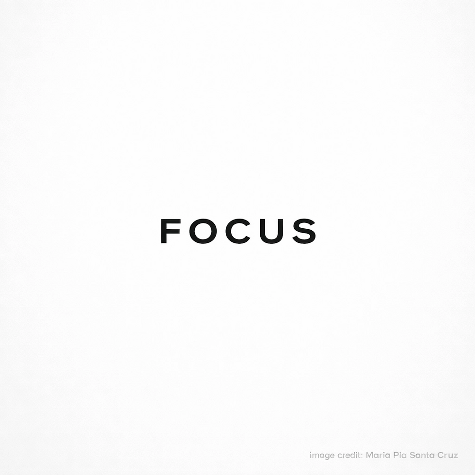
Prompt used (generated with CHAT GPT) Create a minimalist marketing concept image that demonstrates how negative space strengthens a message. The composition should be mostly white with large empty areas and a single bold focal element in the center, such as one word like “FOCUS”. Use high contrast, clean typography, and strong visual balance. The empty space should clearly guide the viewers eye toward the central message. Modern editorial design style, soft lighting, sharp edges, high resolution, square format. Add small unobtrusive branding text in the lower right corner that reads: “image credit: Maria Pia Santa Cruz”. No extra objects, professional and elegant.
</aside>

Comentarios